
  |
| Those Gorey Covers! THE PAPERBACK COVERS |
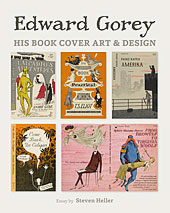
| This segment of Edward Gorey and Anchor Books was reprinted from Collecting Paperbacks? vol. 1, no. 14, by the late Lance Casebeer, the grand daddy of paperback collecting. Reprinted by permission. This exhibit contains sixty paperback cover design and illustration works. Begin the tour...  More about Gorey's cover art work with over 100 covers! New in 2015, from Pomegranate |
At the same time The Unstrung Harp was being published, Gorey was embarking on another project, one which turned out to be part and parcel of a major change occurring in the paperback book industry: designing the covers for the new Anchor Books.
In April 1953, Anchor opened up a new market for paperbacks: the "serious" or academic book. They were the brainchild of twenty-five year old Jason Epstein who convinced Doubleday of the market need for such books in paper editions particularly suited for college use. Epstein's research so impressed the Doubleday executives that they created such a line and made him editor. The format was the same as the taller mass market size (Signet, Ballantine, etc.), but higher in price: 65˘ to $1.45. Anchor was well received from the start, reaching a mass audience through trade book outlets, campus bookstores and some drugstores. And they had Edward Gorey in charge of the covers. As art editor, Gorey was responsible for the total cover package, supplying the lettering, typography and design layouts. Often other artist contributed the actual illustration: Leonard Baskin, Milton Glaser, Philippe Julian and even Andy Warhol; but Gorey then designed the finished product lending a uniform appearance to the whole line. Gorey worked in this capacity from 1953 until 1960, a period which roughly corresponds with Anchor's first two hundred titles. About a fourth of these have line drawn covers by Gorey. He also designed various covers for Vintage, Capricorn, Compass and other publications that followed Anchor's lead. When these covers first appeared against the backdrop of mass-market covers in general, they were hailed as "modern" and "arty". Print magazine praised "a feeling of unity...a quality of their own". The most exact precedent seems to be the Rockwell Kent covers for Boni Paper Books, a larger sized paperback series of the 1930's. Anchor further stood out for their expensive buffed cover stock; no permi-gloss here; and for their eye-catching but underplayed use of color. Instead of four-color separation appropriate for painted illustration, Gorey used color as a design element. Pictorial content was rendered in pen and ink on usually not more than two background tones while the whole cover might be run through the press one extra time to add a pink highlight to the sky (Amerika, A49) or a scarlet pair of gloves to a lady's attire (The Awkward Age, A138). Despite the variety of content and period (from Virgil's Aeneid to Nuclear Weapons and Foreign Policy by Henry Kissinger), there is a haunting thematic consistency about the Gorey-drawn covers. Nearly always there is an implied relationship between a "character of innocence", often depicted as being apart from a group and a "man in black" character. Occasionally this dark embodiment is represented as a mansion (The Wanderer, A14) or sinister statue (The Secret Agent, A8). The best of these covers demonstrate the same whimsical morbidity found in Gorey's narrative works delineated in his meticulous crosshatch style reminiscent of Nineteenth Century book illustration. They are true pendants to the larger body of his work. By opening a new market with a new packaging style, Anchor Books marks the beginning of the end of the first era in American mass market books, when, like the pulps before them, paperbacks had the reputation of being shoddy and sensational. It was the end of an era that would use a girl in a low cut blouse to sell Aristotle as well as Mickey Spillane. This exhibit contains sixty of those design and illustration works. Return to the West Wing or begin exhibit |